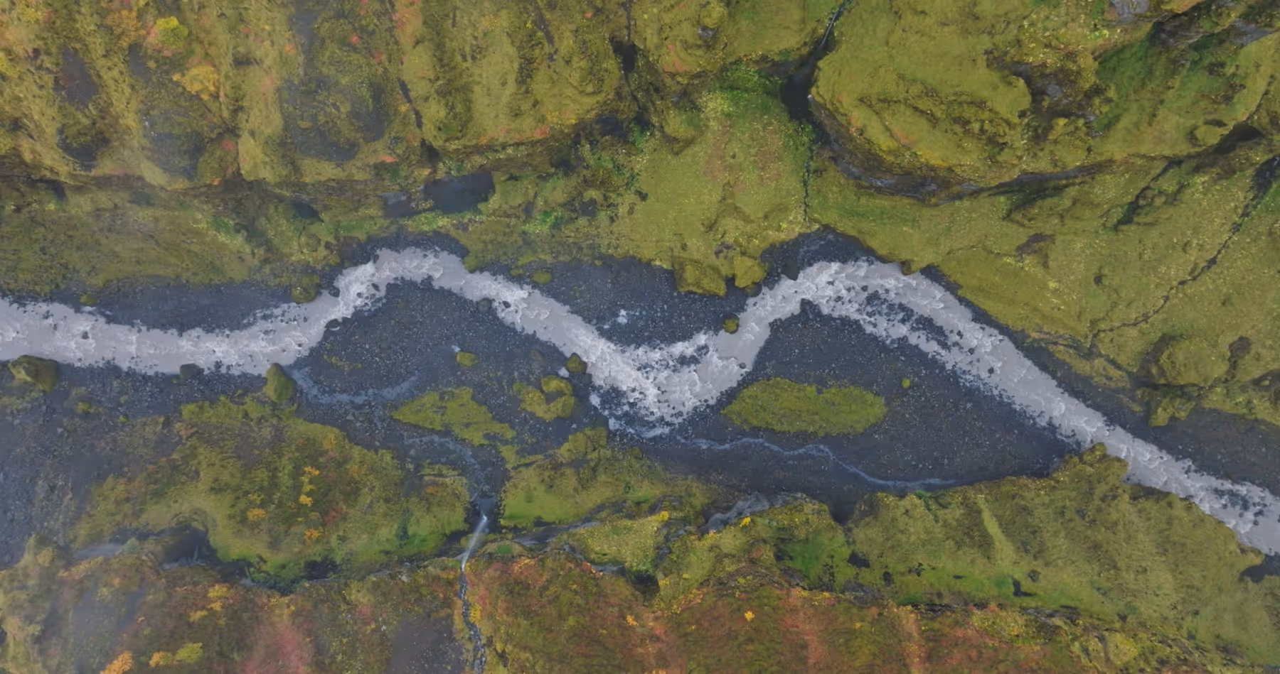
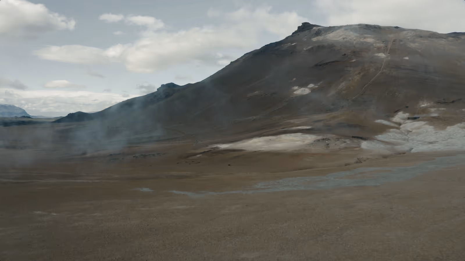
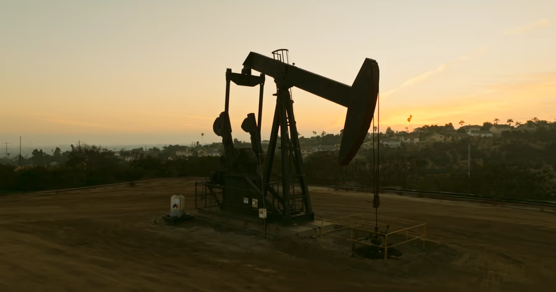
A future where clean, constant geothermal power is universally accessible, achieved by elevating existing infrastructure and engineering smarter solutions — so communities, industries, and the planet can thrive on truly sustainable energy.

Sora
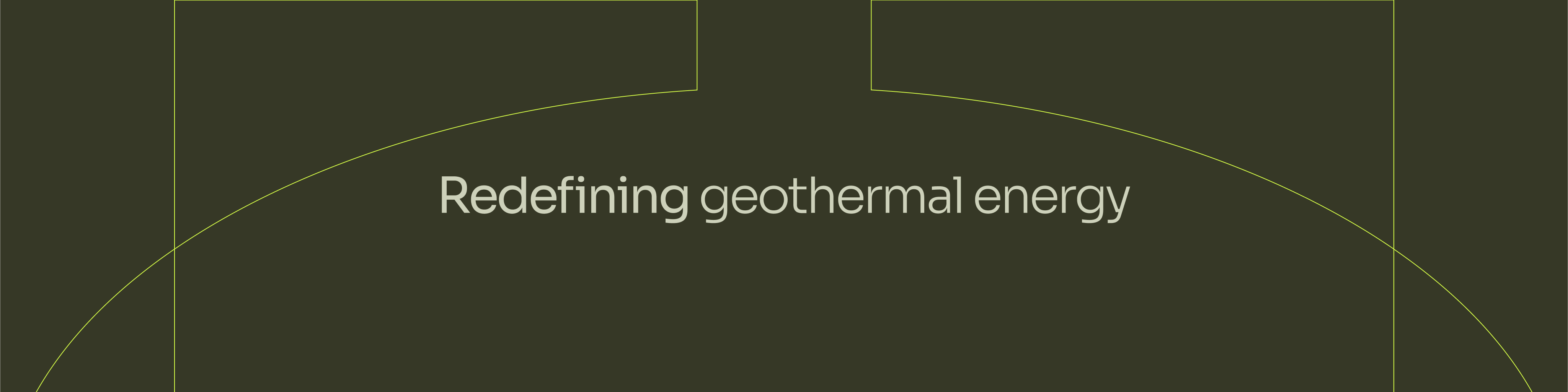
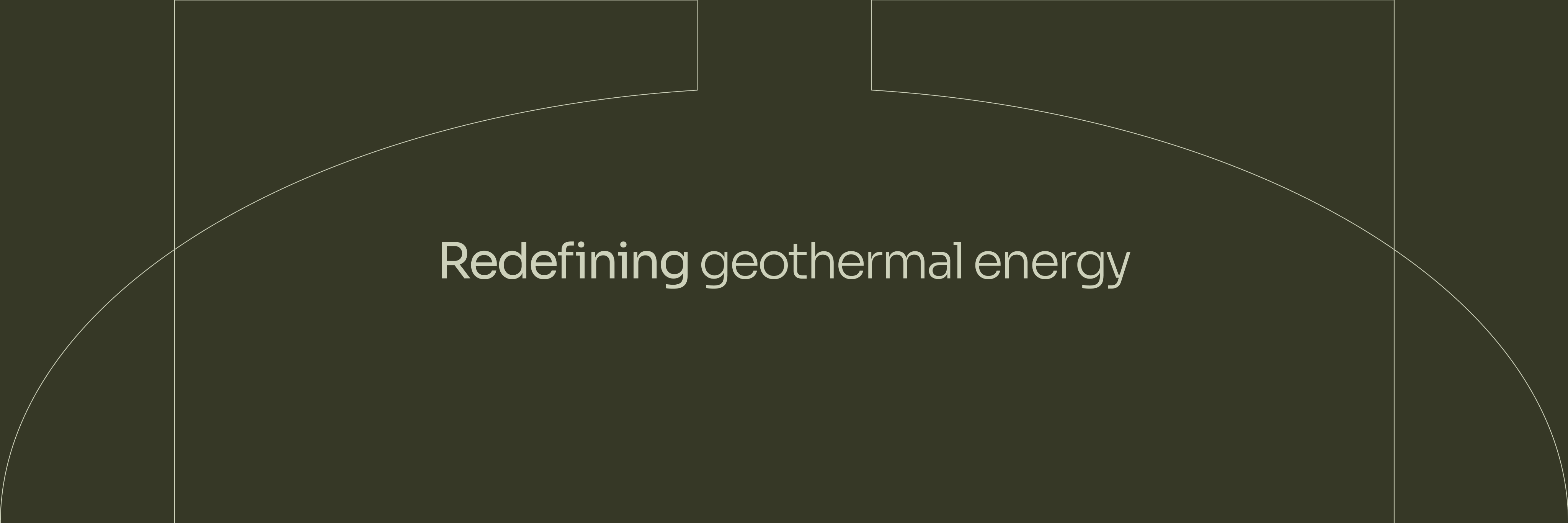
Sora perfectly embodies Factor2’s innovative spirit and commitment to sustainability. The gentle curves and subtle warmth of Sora communicate Factor2’s optimistic yet trustworthy character, reinforcing a sense of continuous evolution and approachable innovation. This typeface is designed to be highly readable across digital and print formats, making it ideal for a data-centric, forward-looking brand committed to redefining geothermal energy and powering a limitless, sustainable future.
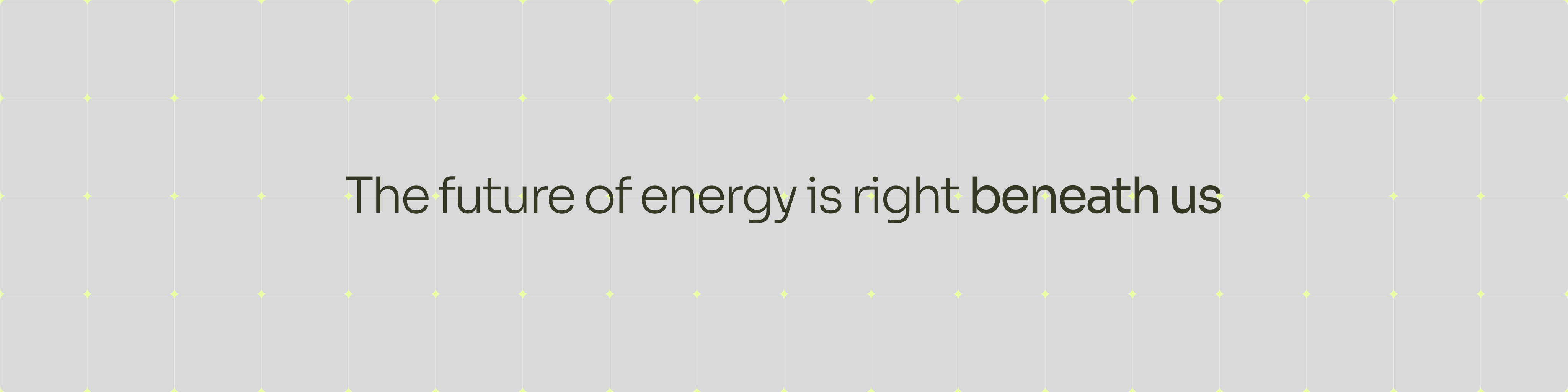
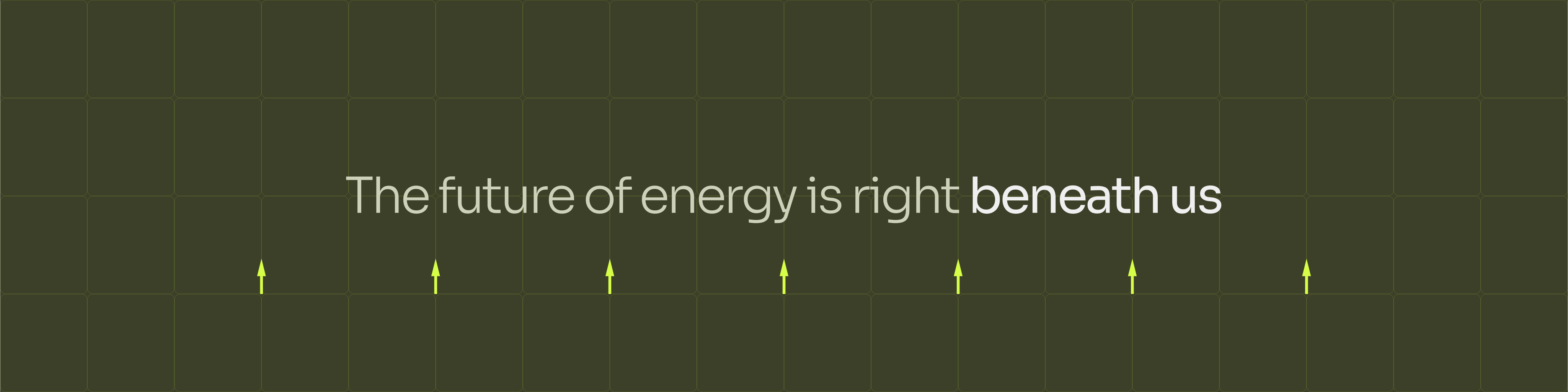
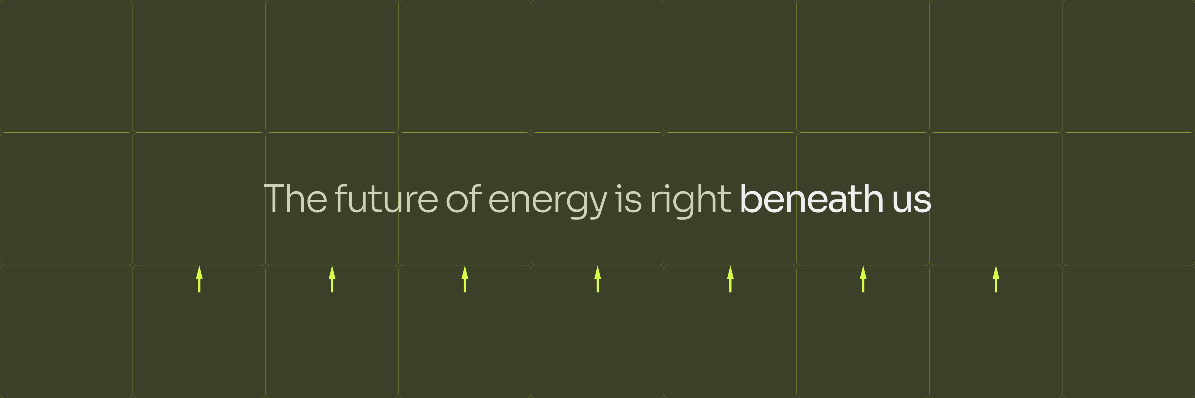
Px Grotesk
Type in use


Grid system
The grid system emphasises clarity, structure, and adaptability, mirroring the precision and reliability at the heart of your geothermal innovations. Inspired by technical accuracy and efficiency, the 12-column framework provides flexibility to communicate complex ideas in a visually balanced manner.
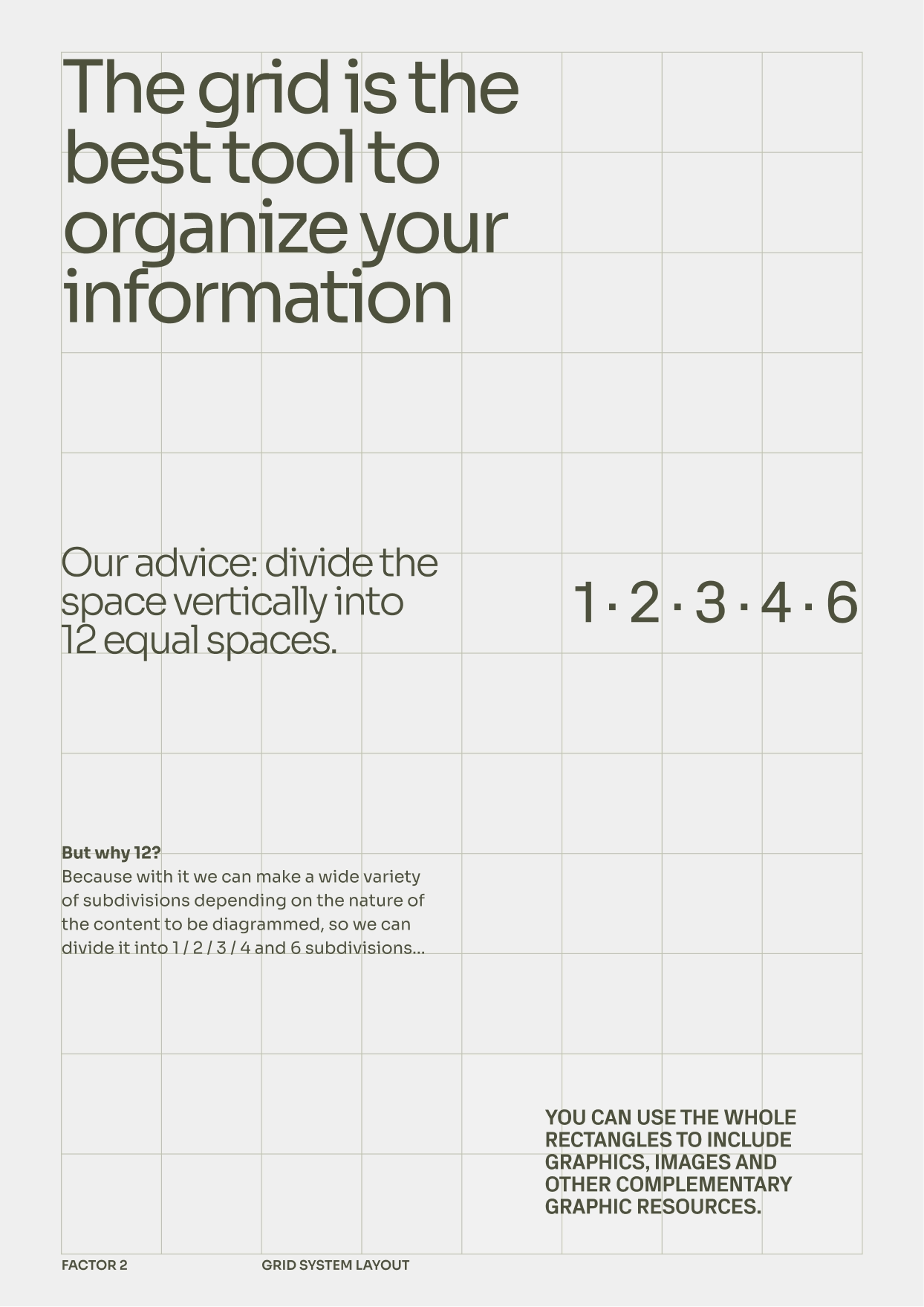
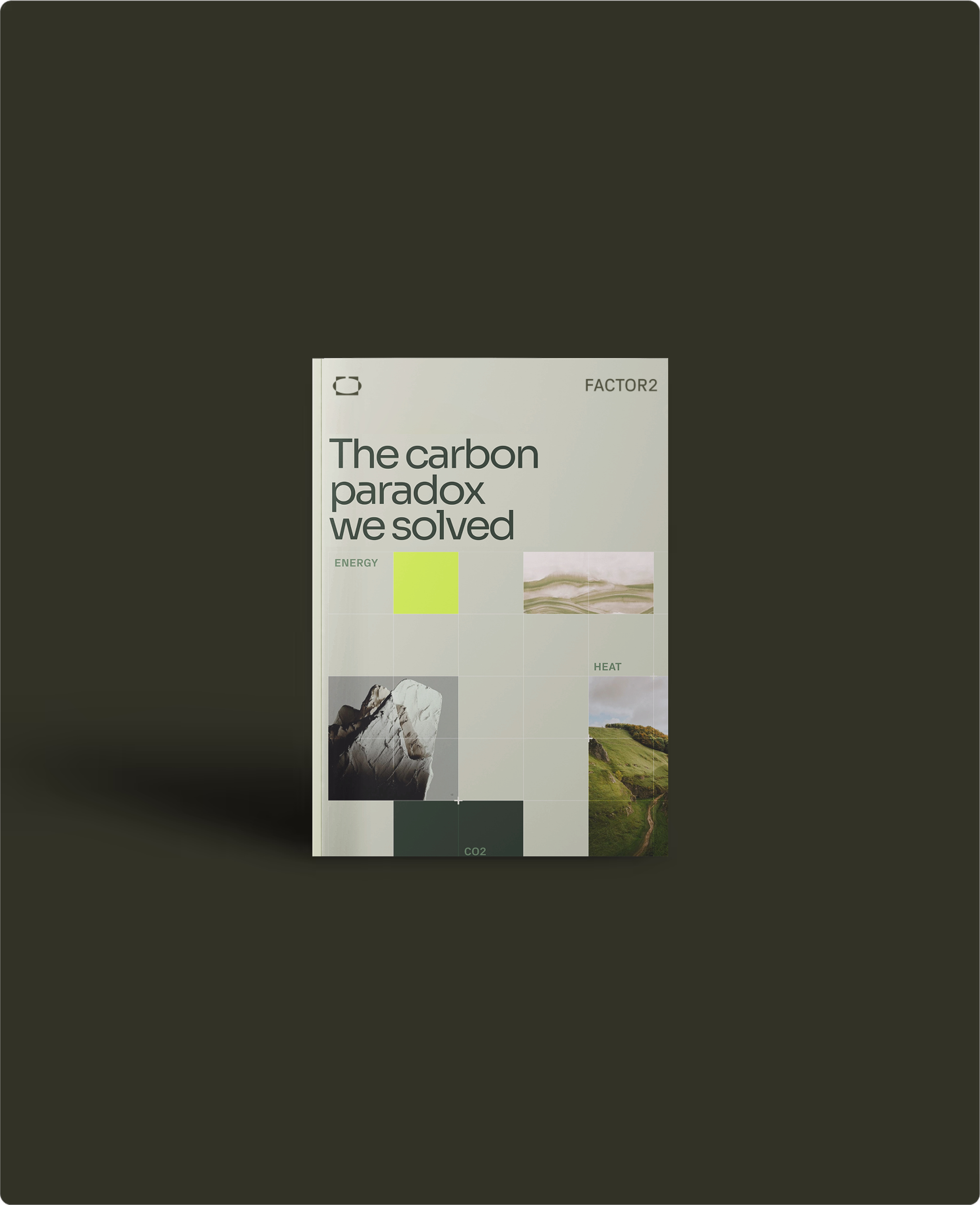
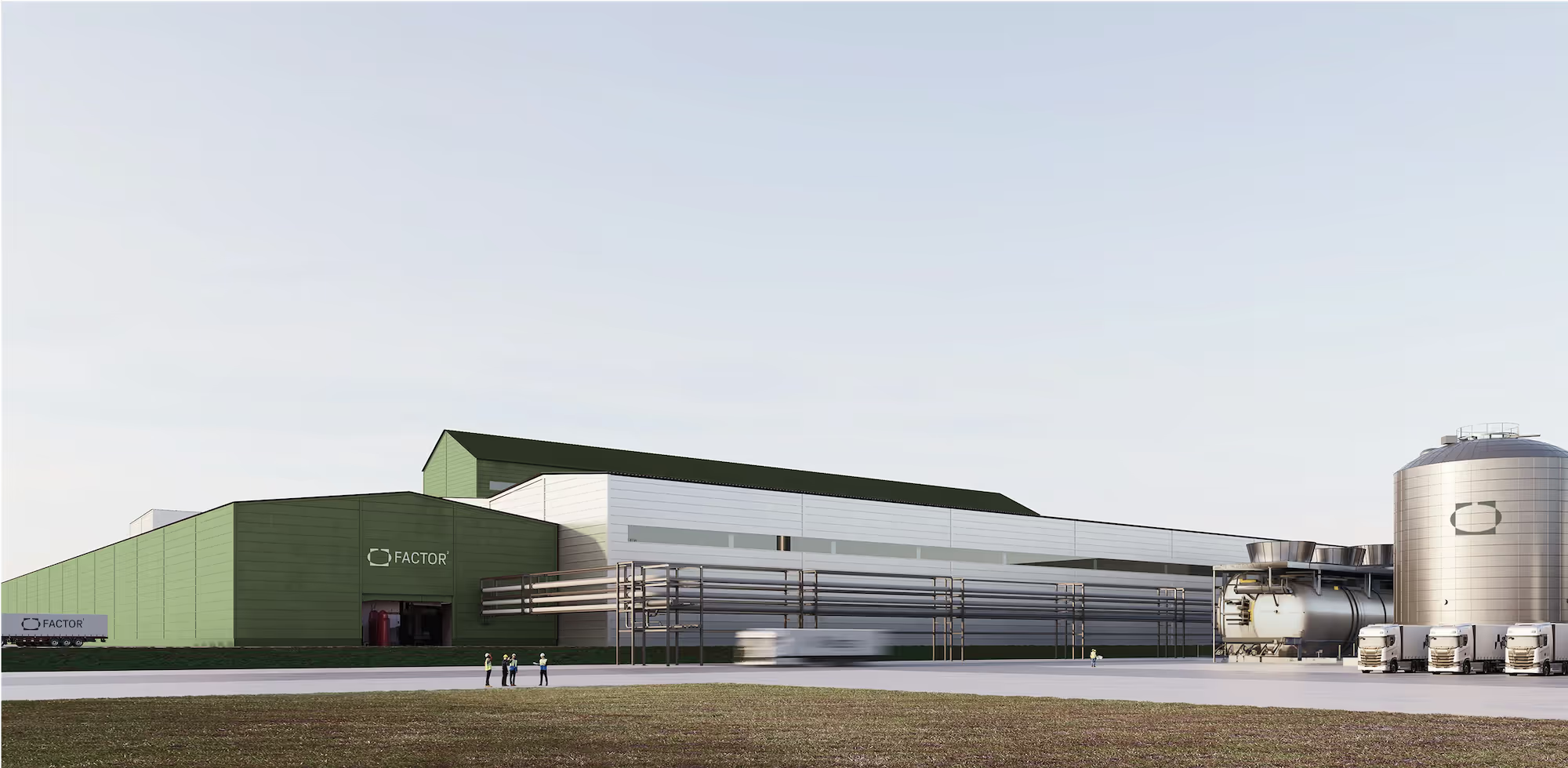
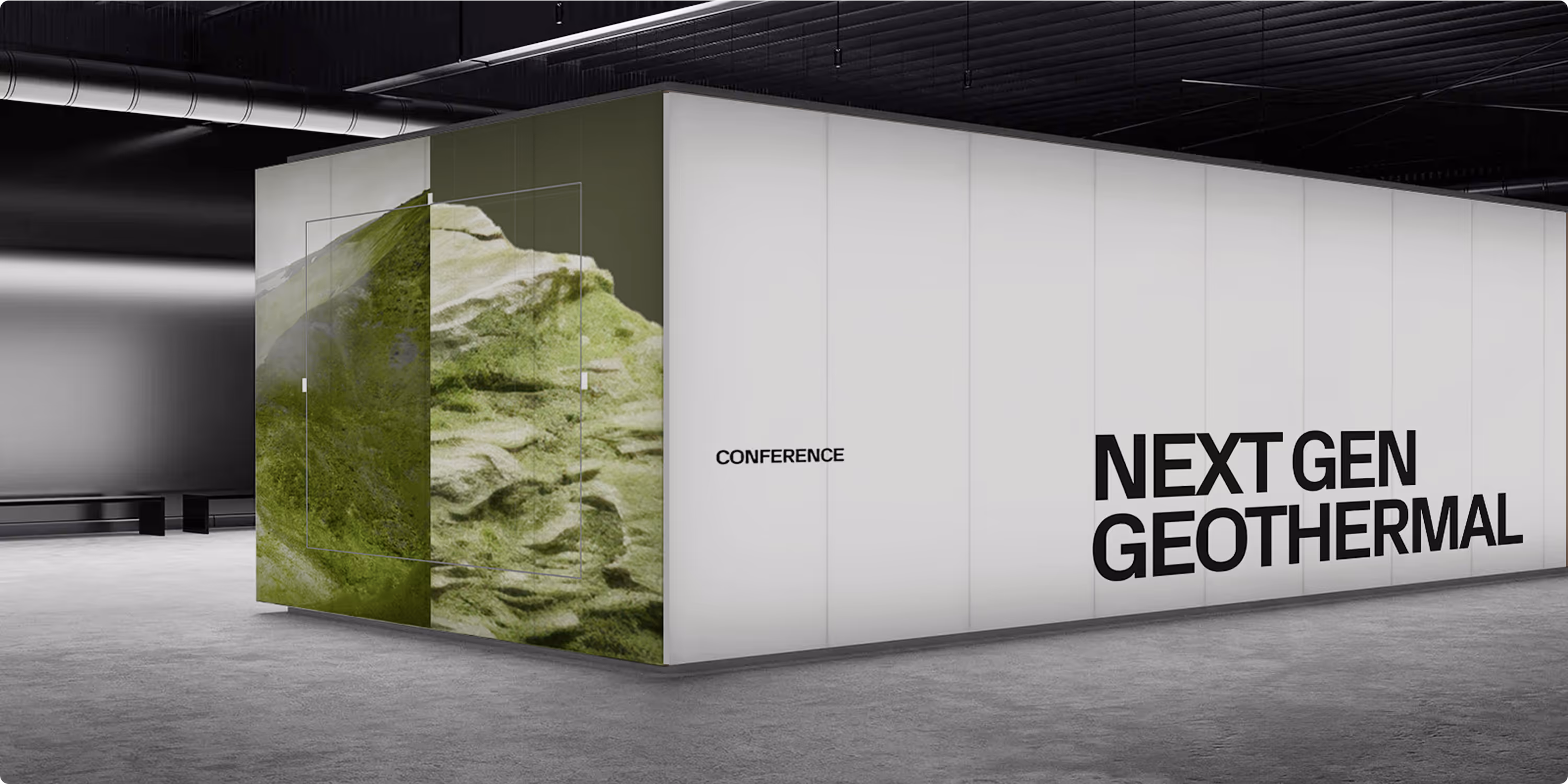
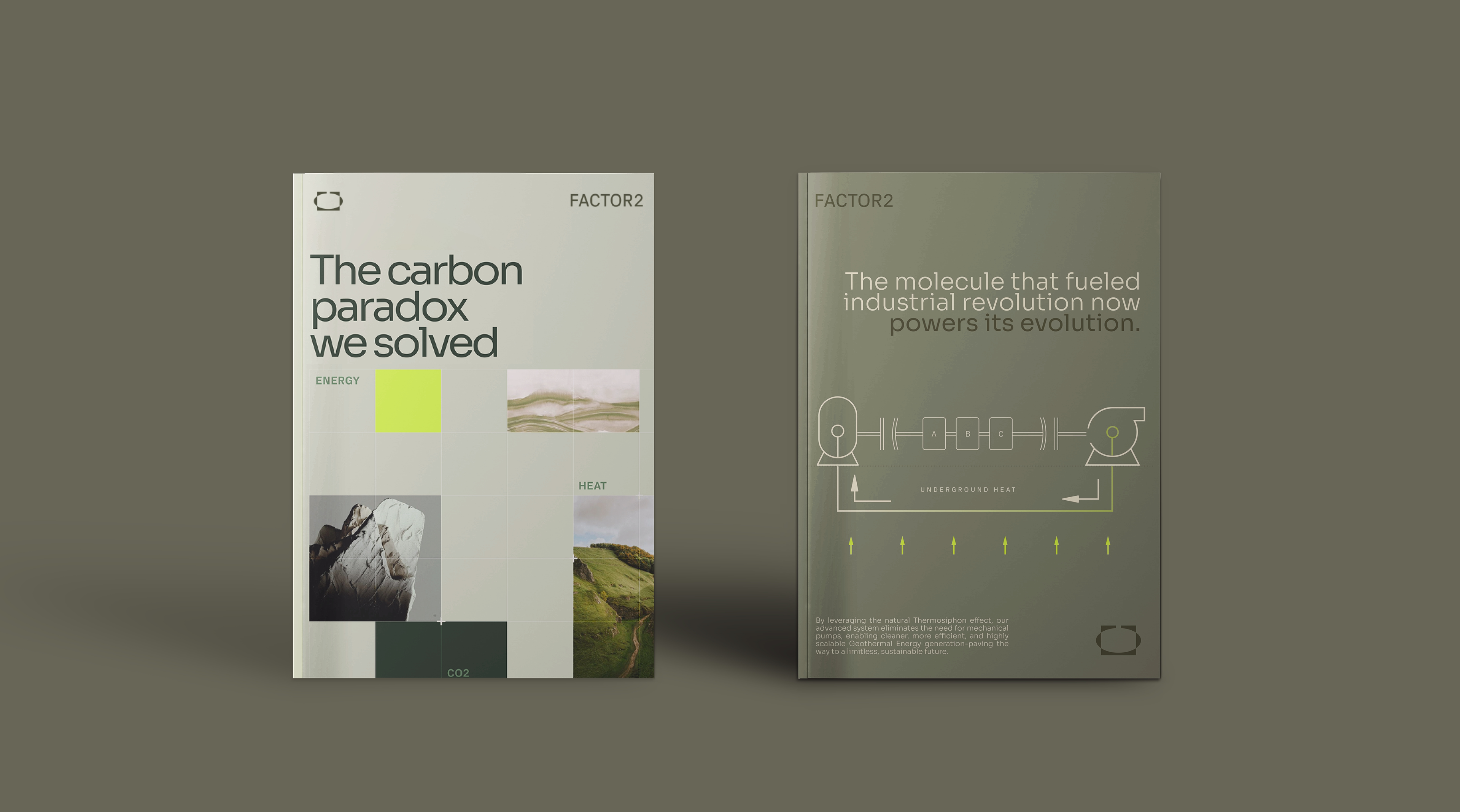
Applying the Grid in Practice
This layout showcases how the 12-column grid enables a harmonious balance between text and visual content. By aligning typography, images, and graphic blocks precisely within the grid, we ensure clarity, hierarchy, and visual rhythm. The result is a structured yet dynamic composition that communicates both innovation and precision—qualities at the core of our geothermal brand identity.
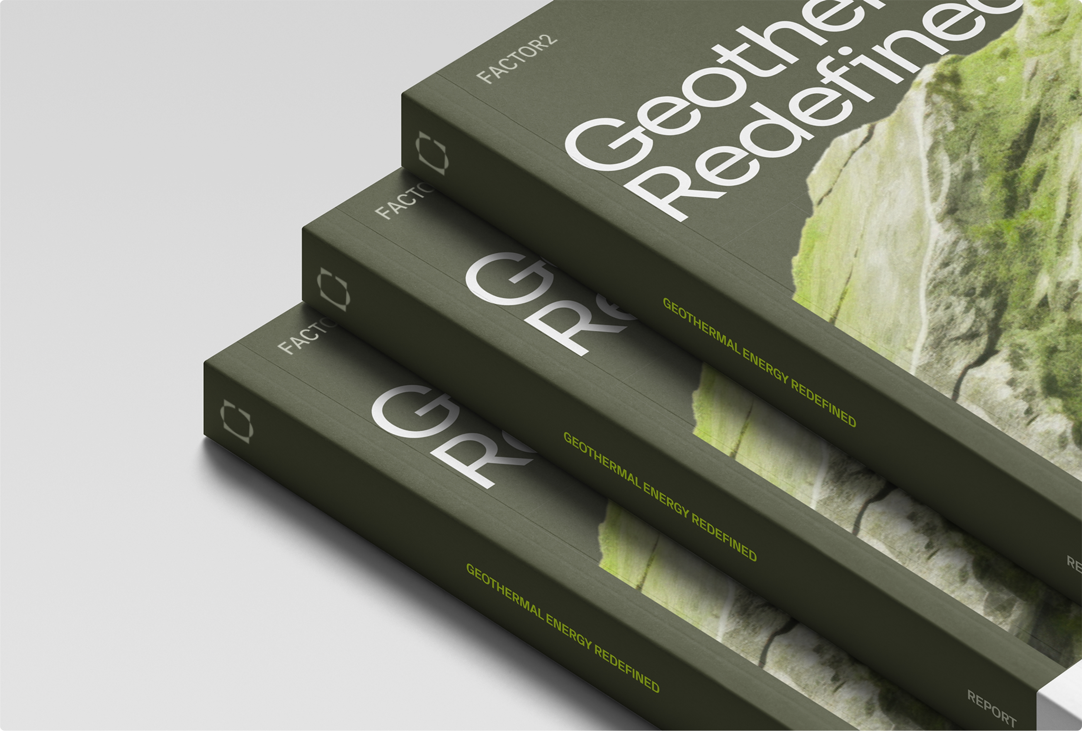
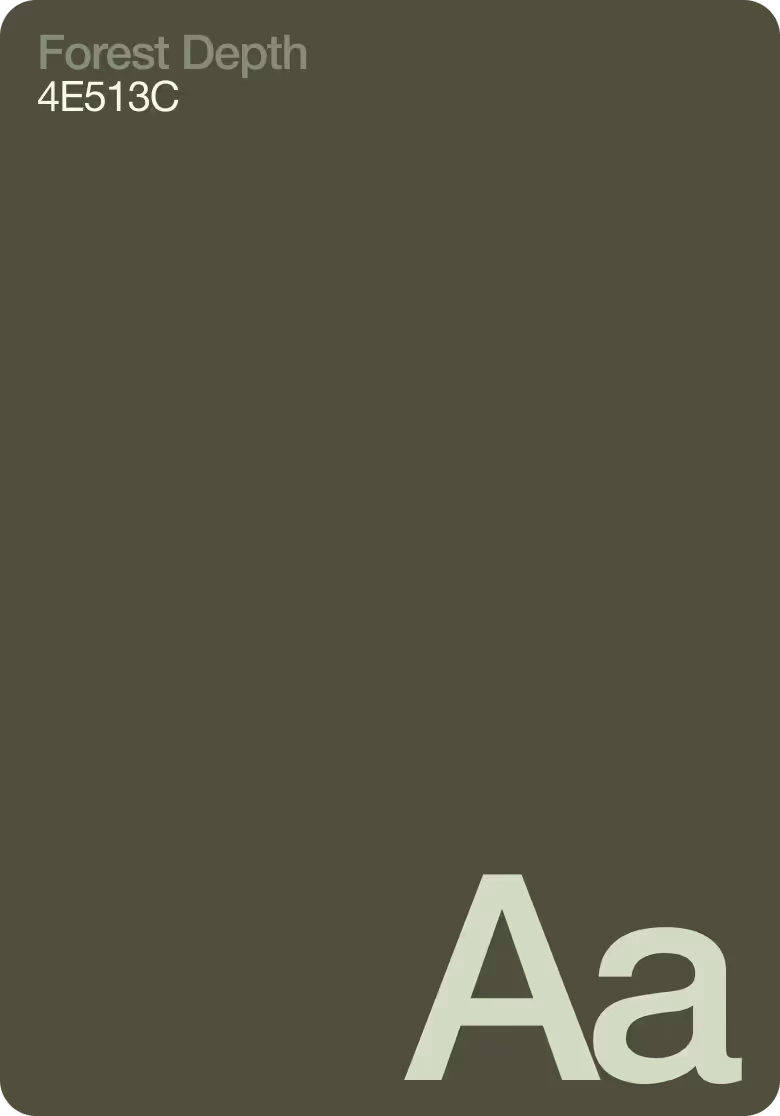
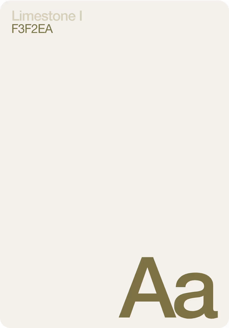
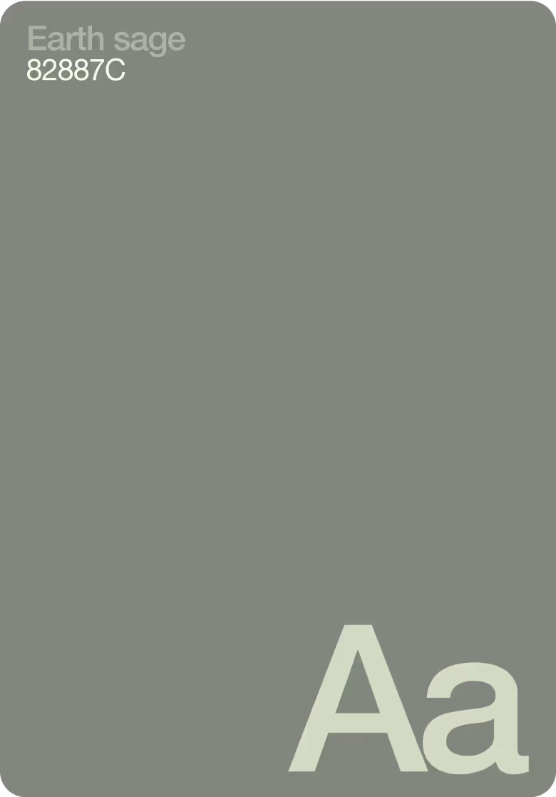
Brand colours
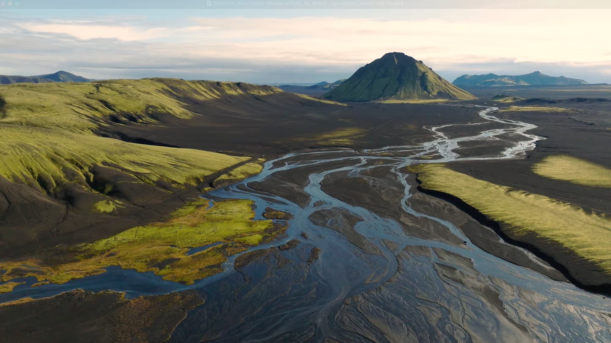
Drawing from hues of core elements of natural CO₂ generation such as limestone (beige/ grey), sulphate minerals (light green)— this palette reflects Factor2's innovative geothermal approach. Bright yellow captures optimism and energy, while earthy greens express sustainability, aligning seamlessly with Factor2's vision of limitless, clean geothermal energy.


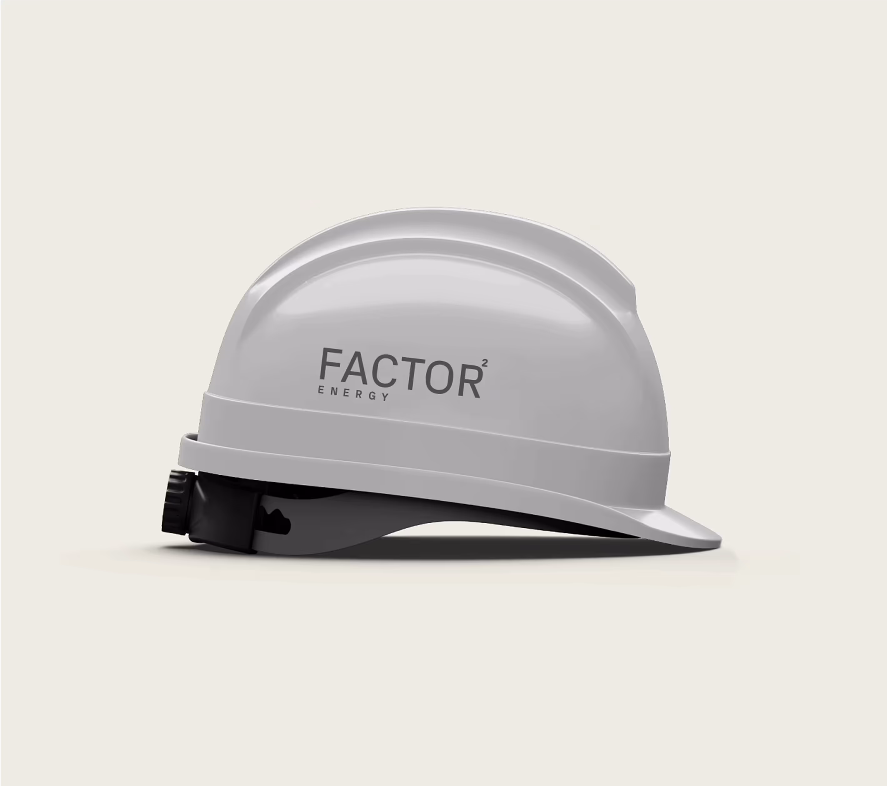
Icons
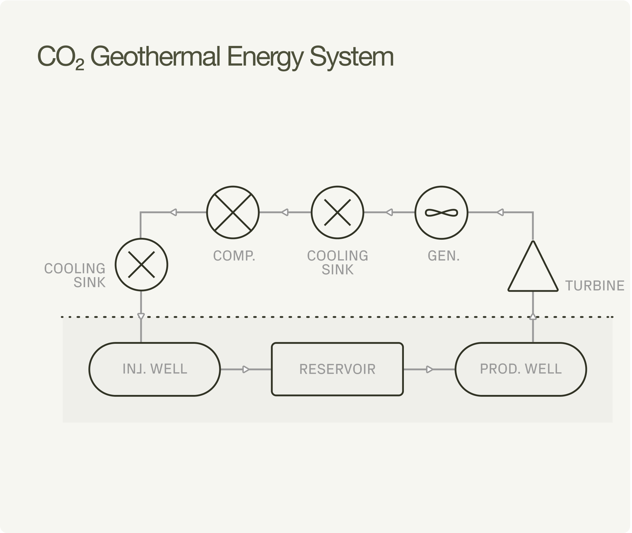
Each icon is custom-designed to visually translate Factor2's unique geothermal approach. Crafted with precision, these bespoke visuals distill complex technical processes into clear, intuitive symbols—mirroring the brand's innovative spirit and dedication to sustainability, clarity, and engineering excellence.
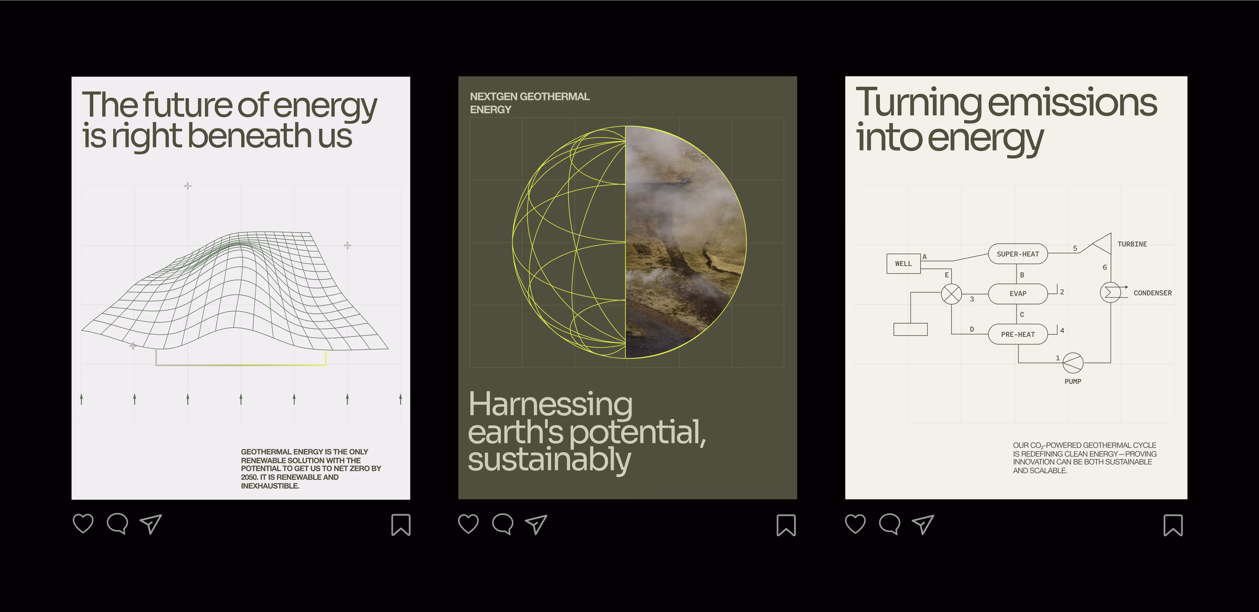
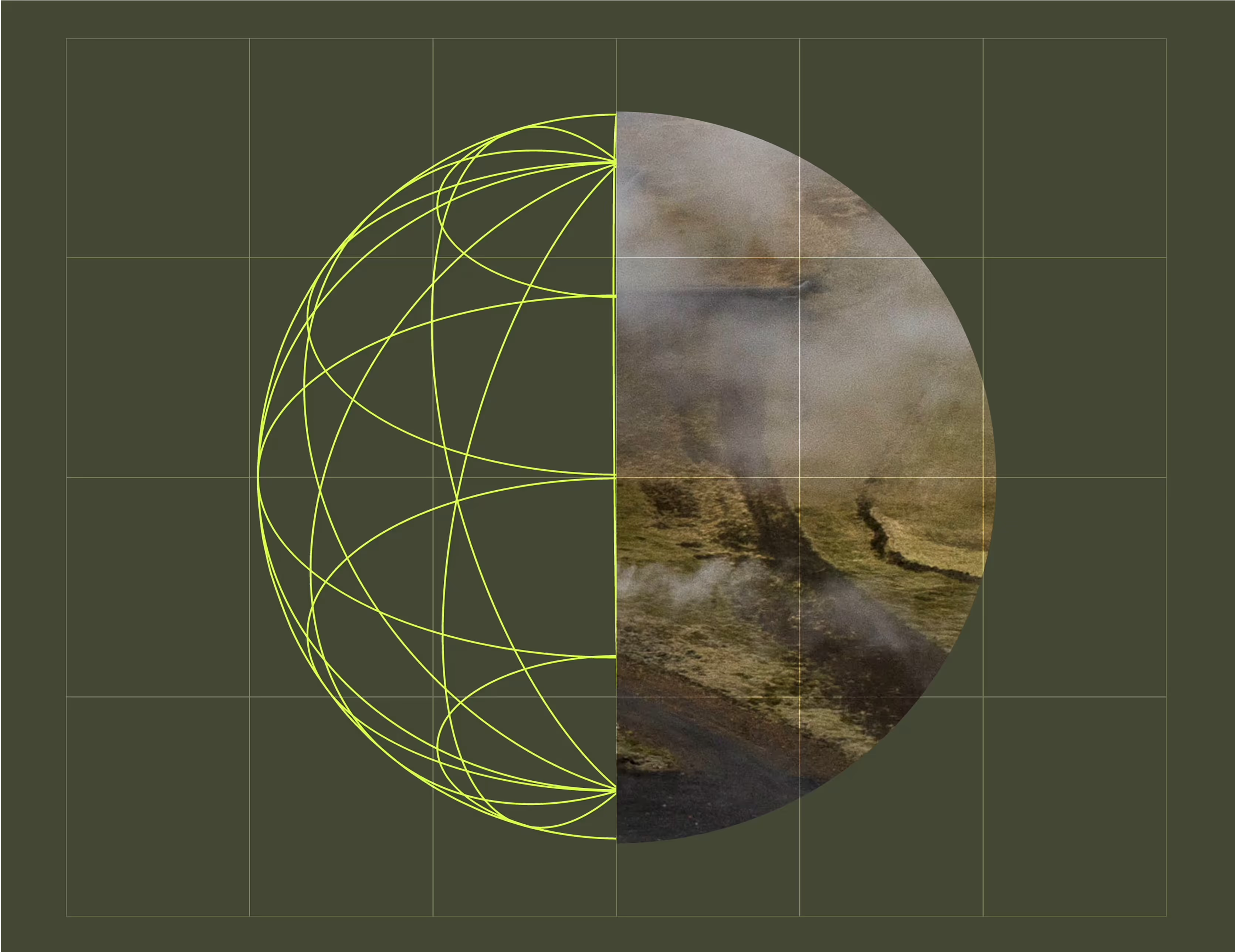
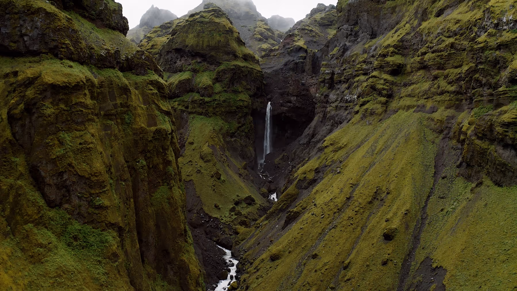
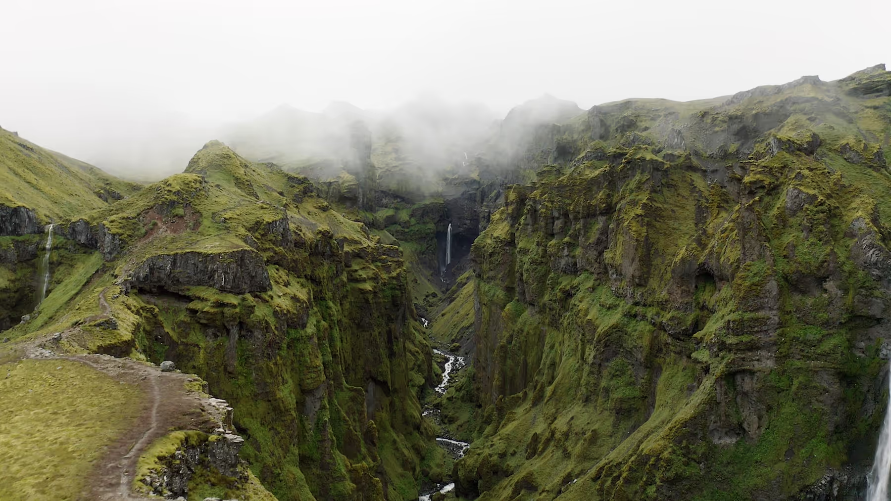
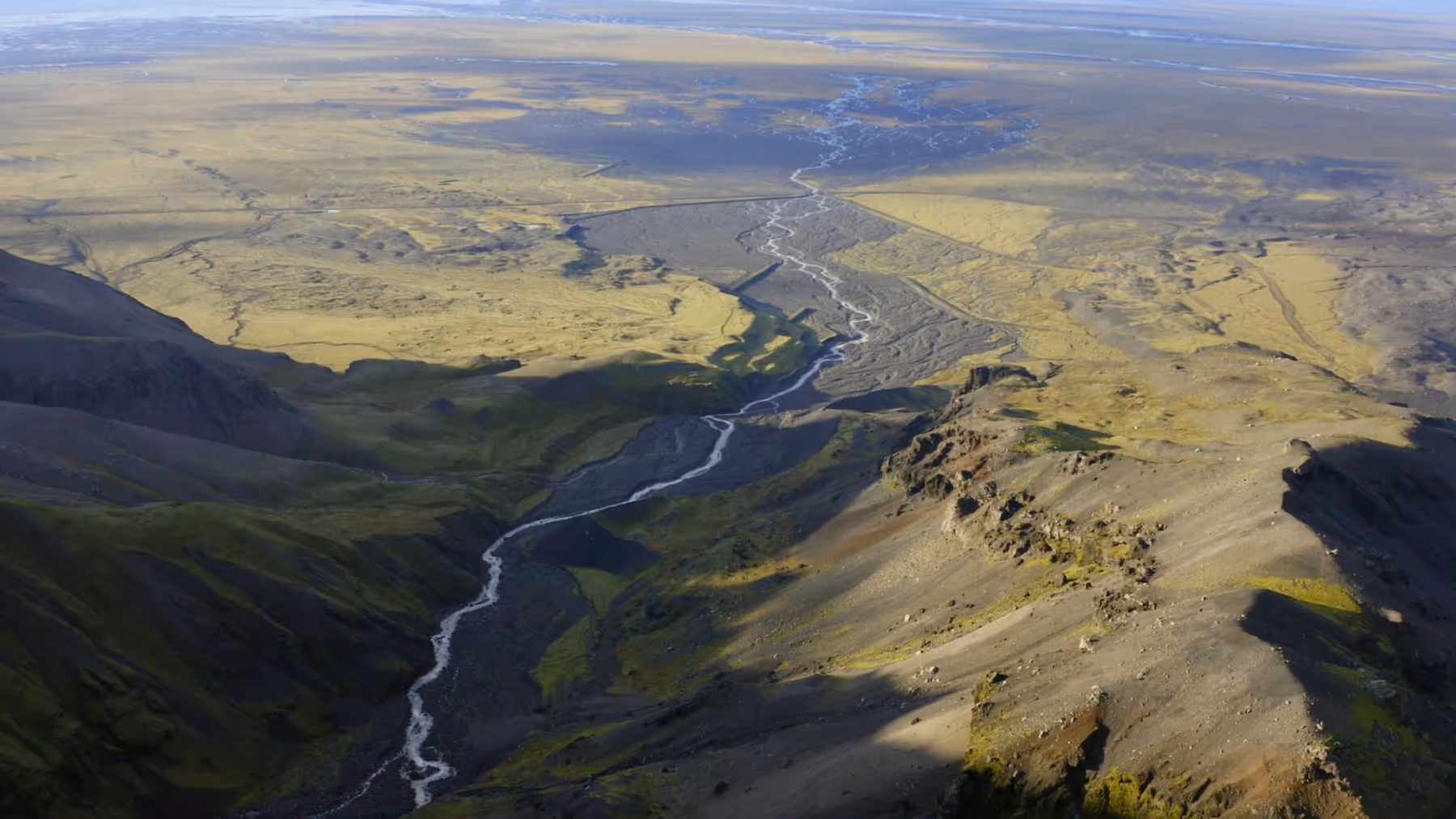
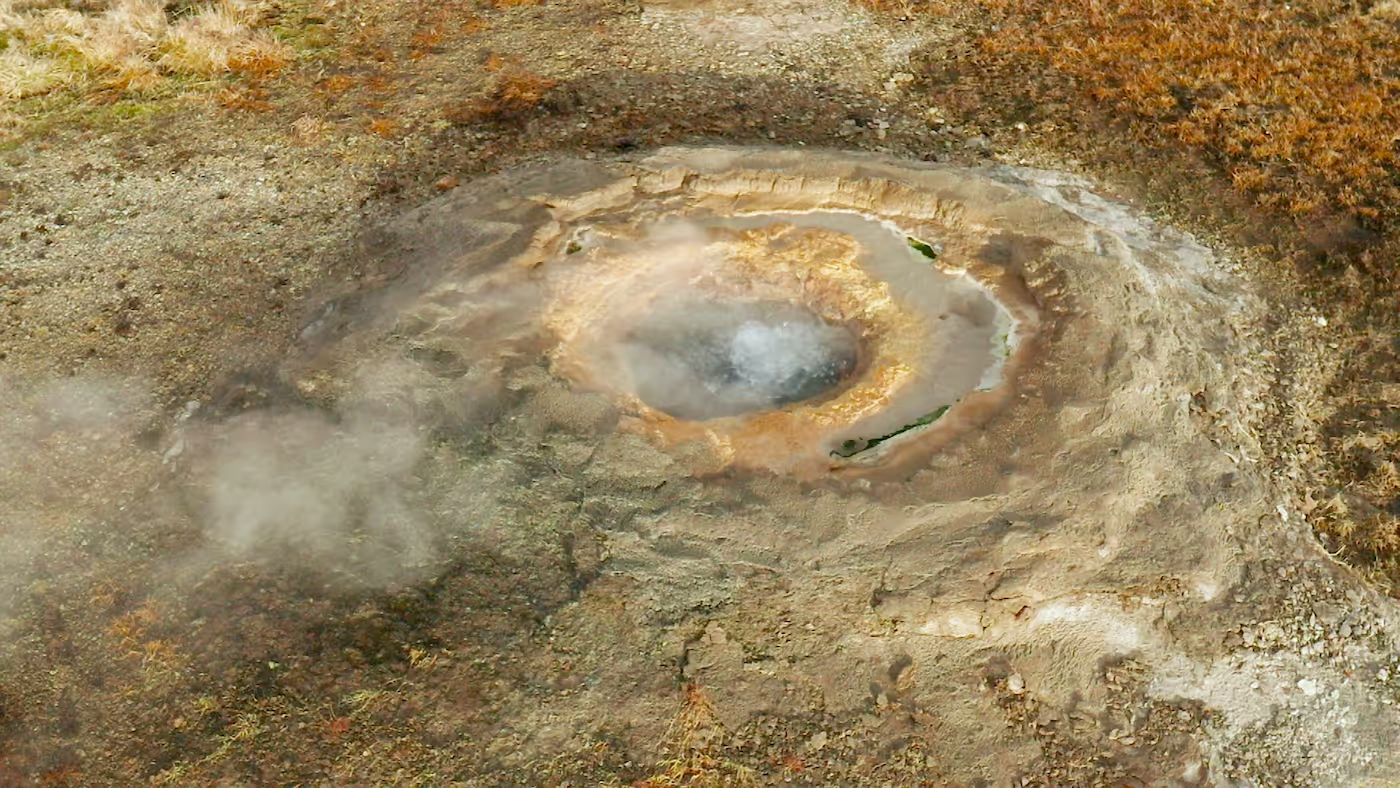
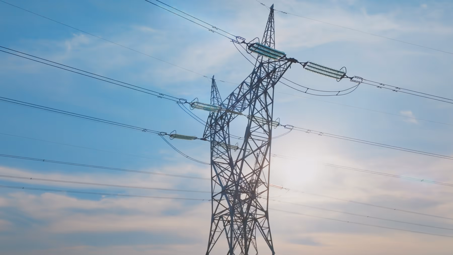
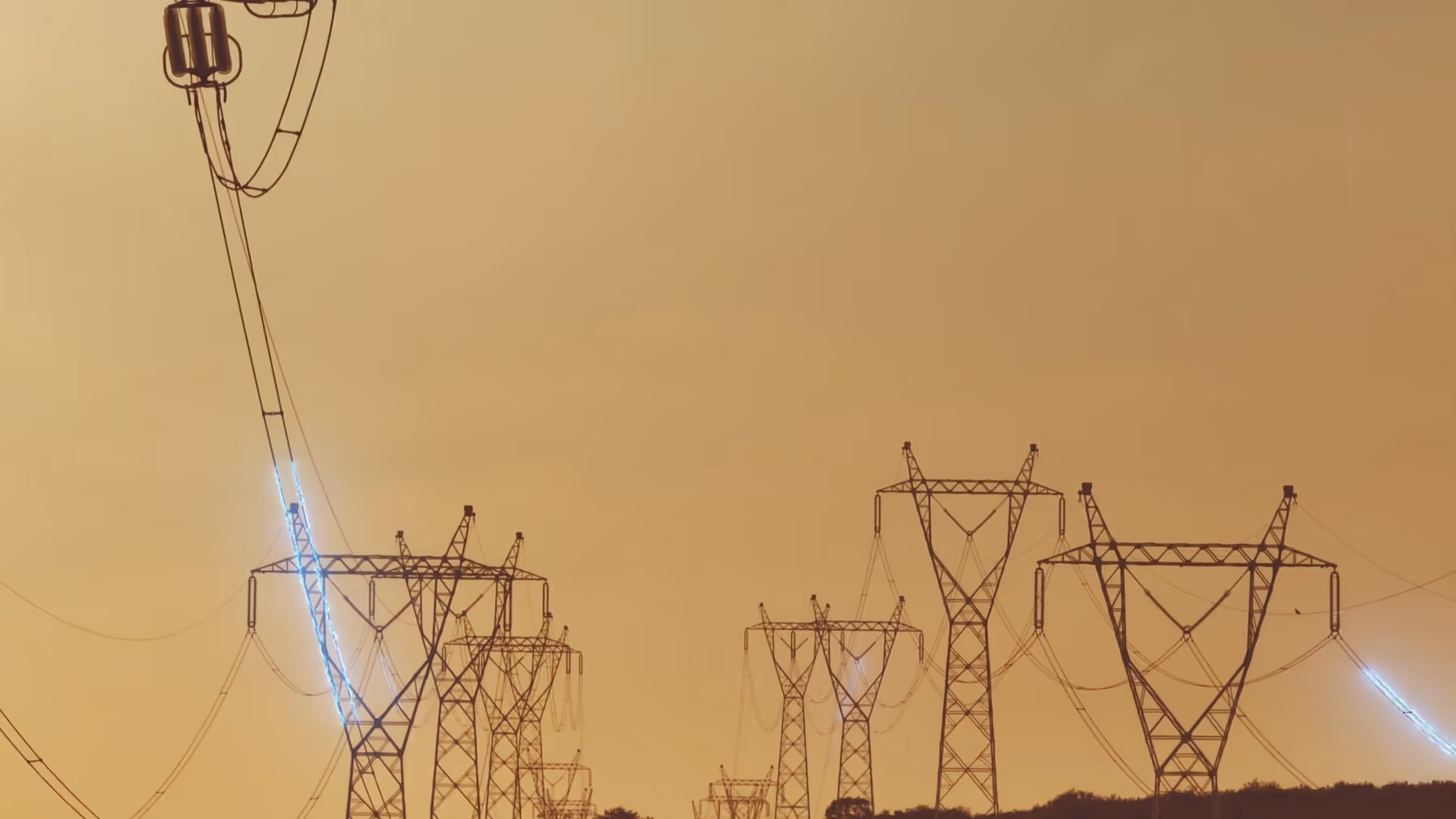
Illustration style
Illustrations for Factor2's visually translate complex geothermal concepts into clear, intuitive graphics. By combining abstract line work with real-world imagery, they reflect Factor2's innovative blend of advanced technology and natural processes. This approach embodies the brand's commitment to bridging technical sophistication with environmental harmony, emphasizing the limitless potential of geothermal energy powered uniquely by CO₂.
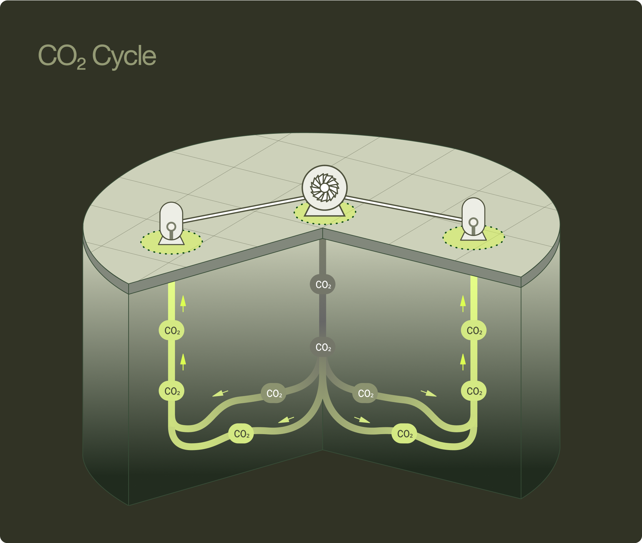
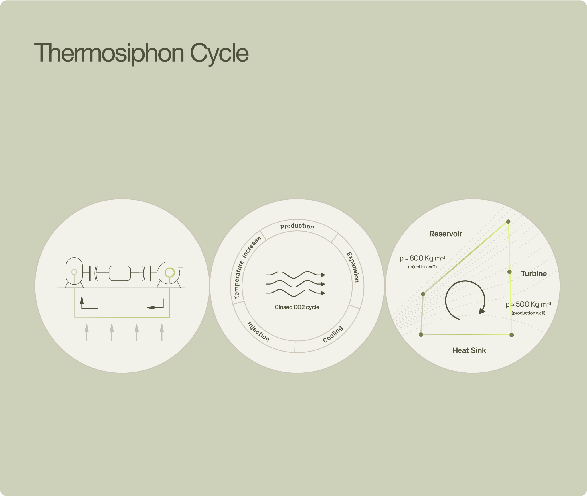

The logo mark represents a CO₂-based geothermal energy system. The oval serves as a window—a cross‑sectional glimpse into the hot subsurface—inviting the viewer to see the process from an entirely new angle, with the right part of the logo representing the injection of liquid CO₂ and the left, the return of much lighter, gaseous CO₂—about half the density—driving a self‑sustaining thermosyphon which yields factor‑two more energy under the same geological traditional boundary conditions. The logo is designed to convey the simplicity and power of this innovative method, using two key shapes to reflect its process.

Logo suite
A Window into the Subsurface. Factor2's visual identity is built on the physics of our core technology. The logo mark represents the CO2 circulation loop, with the oval shape serving as a lens into the geothermal process. This modular system allows the brand to shift seamlessly from the technical precision of the full wordmark to the subtle confidence of the standalone symbol, ensuring distinct recognition across all physical and digital environments.